iwoca rebrand
iwoca is one of the fastest-growing business lenders in Europe. It was created to help small businesses open doors to new opportunities. We want this to be the first thing our customers see, so we created new branding based around this concept.
Sabina Chipară helped us to design Aesop, a custom-made typography for iwoca. The features of iwoca's logotype were used as the base of the typography, however, it is slightly narrower in order to accommodate more text on narrower displays.
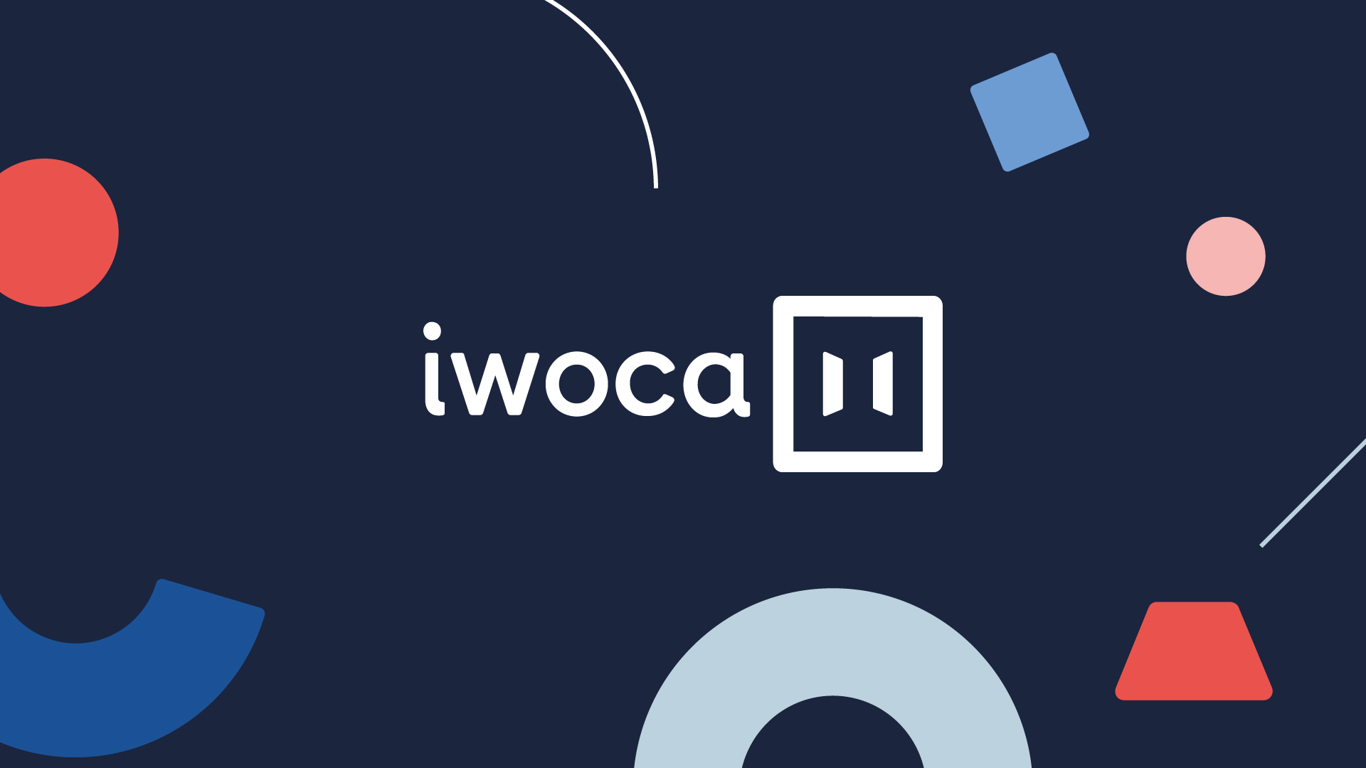
For our visual language, we deconstructed shapes from the negative spaces of our logo characters. The visuals reflect how accessible and personal the process of getting a business loan is with iwoca.
To expand on the personal element, we were influenced by the work of Wassily Kandinsky. With the use of his compositions we articulated a sense of space and placement. Thanks to Avi Ashkenazi, Quim Marin Studio, Stupendous Studio and Kirsten Smith.
Roles
Designer
Services
Branding & Identity
Icon Design
Editorial Design
Visual Design


You might also like

© Kreative Kam — All rights reserved